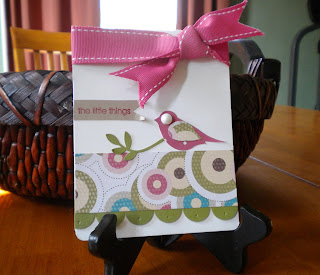
 Good Morning! The sun is shining, but it's deceiving. . . It's still frigid outside. I am READY for Spring. Here's another project from Stamp Club. I made this bookmark card using the Splitcoaststampers tutorial found HERE. I adore this idea! Send a beautiful handmade card to someone special and they can keep a part of your special creation by using the attached bookmark. I sent my first one to a friend for her birthday and she LOVED it. I think my club ladies like the idea too. . . The best part - the card still measures 4-1/4" x 5-1/2, which means it will fit neatly into a standard envelope. I got the inspiration for the colors from my new Basic Gray satin ribbon. I was dying to use it on something, so I built my color scheme accordingly. The layered flowers were seen HERE first. I loved how she used completely different colors for the flower layers. Very cool.
Thanks for looking. Oodles of Toodles!
~~~~~~~~~~~~~~~~~~~~~~~
Paper: Rich Razzleberry, Pink Pirouette, Basic Gray, Old Olive, Basic Black and Guest Book DSP (card front); Rich Razzleberry, Basic Gray, and Whisper White (bookmark); Kraft (card/bookmark base)My Recipe:
Stamps: Fifth Avenue Floral, Define Your Life and En Francais (background stamp)
Ink: Rich Razzleberry, Pretty in Pink, Basic Gray, Basic Black, Old Olive and Jet Black Stazon (flowers)
Stamps: Fifth Avenue Floral, Define Your Life and En Francais (background stamp)
Ink: Rich Razzleberry, Pretty in Pink, Basic Gray, Basic Black, Old Olive and Jet Black Stazon (flowers)
Accessories: distressing tool, perforating tool, sponges, Extra Large Two-Step Bird Punch (leaves), Basic Gray 5/8" Satin Ribbon, staples, Chit-Chat Rub-ons, Stampin' Dimensionals and Modern Label Punch
Bling: Clear Rhinestone Brad


